
Why Brand Guidelines Matter
When you’re starting out as a designer, one of the first things you quickly realize is that brand identity sits at the heart of everything you do. As you explore and experiment with your design choices, you naturally begin to define a set of visual rules; your own system of colors, fonts, and styles that give shape to the brand. Instinctively, you’ll pick a typeface that feels right for the project, a color palette that speaks to the essence of the business. Branding becomes the lens through which design starts to make sense. It gives meaning to your decisions and anchors the design with intention.
Early on, I found myself drawn to creating logos and full brand identities. Without even realizing it, I had started building foundations. You can’t go far in a project without knowing what font to use or which colors reflect the tone you’re aiming for.
As you keep designing, you’ll sometimes stumble upon something that looks better, something that could work, but it might not fit. That’s where brand consistency becomes critical. Brand rules can evolve, yes, but they need to evolve intentionally. When a brand changes too frequently or too drastically, it risks losing recognition—and more importantly, its identity.
As designers, we start by laying out rough rules. But as a project grows, the number of decisions increases, and it gets harder to remember or stay aligned with those early choices. That’s why having an organized design system or a set of brand guidelines is essential. It gives you a reference point, a way to stay grounded in the brand’s visual language while still allowing creativity to flow.
These guidelines become even more important when you’re working in a team or handing your work off to another designer. They’re not just helpful, they’re foundational. Brand guidelines ensure that no matter who touches the design, the identity remains intact.
So if you’re wondering what brand guidelines are and why they matter, you’re in the right place.
What Are Brand Guidelines, Anyway?
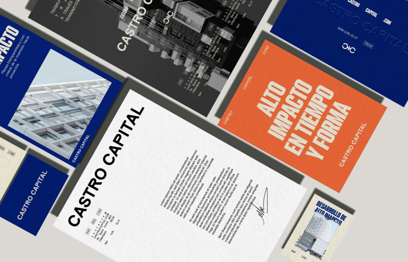
Think of brand guidelines as your brand’s manual. They’re the set of rules that keep everything looking, sounding, and feeling like you, no matter where your brand shows up—whether it’s a website, a business card, or the side of a delivery van.
At their core, brand guidelines usually include:
-
Logo Usage: How to use (and not use) your different logo variations and lockups. Including which lockups and variations should be used in certain circumstances, how much safe space it needs, and what to never do with it.
-
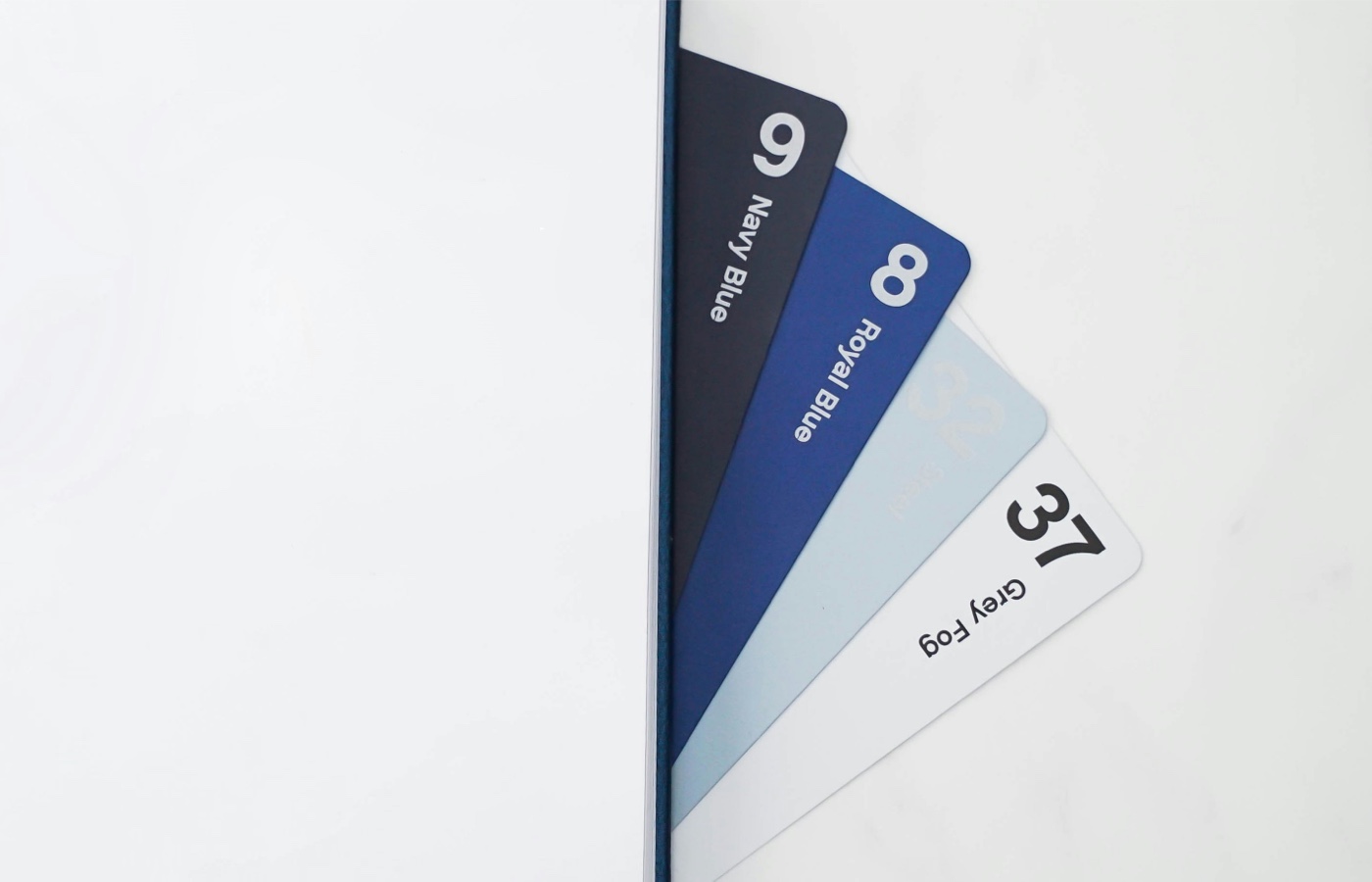
Color Palette: Your exact colors, usually listed with HEX, RGB, CMYK, or Pantone codes. Because “close enough” isn’t really close enough when you’re building a recognizable brand.
-
Typography: What fonts and styles to use under what circumstances. This keeps everything looking like it came from the same place.
-
Voice & Tone: How your brand speaks. Maybe you’re casual and chatty, or formal and precise—whatever it is, this helps make sure your messaging sounds consistent across the board.
-
Imagery: The general feel of your visuals—are they clean and minimal? Playful and bright? Grungy and raw? It matters. Brand imagery and mockups of how the brand can be implemented are crucial to give a good idea of how the brand can interact with customers.
Brand guidelines can definitely feel like overkill at times. And yeah, some of them turn into these massive, overly detailed documents—but they don’t have to be. For smaller brands or early-stage startups, a simple one-page brand kit or cheat sheet can do the trick. It’s really just about giving people enough information to allow anyone to use the brand assets you created in the way you intended for them to be used. The goal isn’t to micromanage every pixel—it’s to hand over a map so no one gets lost along the way.
Why Freelancers and Startups Shouldn’t Skip This
If you’re freelancing or building a startup, you might be thinking, “Brand guidelines? That’s for the big brands with big budgets.”
I used to think the same. Back when I was starting out as a designer, my hand-off process was pretty simple: I’d email over a few logo variations in different colors and black-and-white formats, call it a day, and move on. Job done, right?
But then I started seeing those same logos pop up in the wild—wrong colors, poor placement, or stretched beyond recognition. At first, I was frustrated, but eventually, I realized it wasn’t their fault. Just sending off a few logo files isn’t enough to build something lasting. It was a poor handoff on my side.
After a few hard-learned lessons, I started including one-page brand kits along with my deliverables. Just a simple PDF with logo variations, the right colors (with their codes), and a quick overview of how to use them. It made a huge difference. Not only did it protect the work, but it added a real sense of professionalism to the service I was offering.
That was over 25 years ago. Fast forward to today, and I now deliver fully responsive, interactive online brand kits. These include every logo lockup, clickable color swatches, typography examples, brand imagery, mockup examples, along with all the downloadable assets in all their file formats. This is a game-changer for brand designers. Not just because it simplifies and structures for brand identity hand-offs, but because it becomes a tool that brands can actually use on a day-to-day basis.
And here’s the kicker: because these kits are hosted online, they can be updated in real time. No more outdated PDFs floating around that can be wrongly used. Everyone from in-house teams to external creatives are always working from the same, always-up-to-date source.
So while full-blown, detailed brand guidelines might still feel like overkill for a small brand or startup. Online brand kits are practical, useful, and honestly a must-have in today’s fast-moving design world.
How Guidelines Actually Help Your Work
Brand guidelines do way more than just keep things tidy. Sure, they help organize your visual assets, but their real power is in how they elevate the entire brand experience—from how your designs look, to how your marketing lands, to how much people trust your brand. When done right, they become the invisible thread tying everything together.
Design That Feels Unified
Good design doesn’t just look good—it feels intentional. It feels like it belongs. When your brand has clear guidelines, everything from your Instagram stories to your product packaging looks like it’s coming from the same place. There’s a visual rhythm and logic that just makes sense.
Take Apple, for example. You could remove the logo and you’d still recognize their work. From the typography to the tone of voice to the lighting in their product photography, it’s all carefully crafted and obsessively consistent. That kind of cohesion isn’t a happy accident—it’s the result of crystal-clear brand guidelines followed religiously.
Now, we’re not all Apple, but even for small businesses or solo creators, that level of consistency makes a massive difference. It turns scattered assets into a recognizable brand.
Marketing That Actually Flows
When your visual language and tone of voice are already defined, marketing becomes a whole lot easier. You’re not reinventing the wheel every time you need a flyer, ad, or social post. You’ve already got the blueprint—you just build from it.
No more Slack messages or client calls asking, “Wait, what green do we use again?” or “Is this the font we used last time?” You eliminate the guesswork, avoid rounds of back-and-forth edits, and can move faster while staying on-brand.
Whether you’re writing a caption, designing an email campaign, or launching a new product—your brand already has a style. Your job becomes making sure it shows up, not figuring it out from scratch.
Trust That Builds Over Time
The more people see your brand looking, sounding, and feeling the same, the more they trust it. Familiarity builds confidence. Whether someone sees your brand on a billboard or a mobile ad, they should instantly know it’s you.
That kind of consistency doesn’t just help customers—it helps you. It makes your work more valuable, more referable. I’ve seen it firsthand. When your branding is dialed in, people take your work more seriously. Clients feel like they’re getting a complete, professional package, not just a bunch of designs.
And here’s the best part—you feel more confident too. When you know the brand inside and out, and you’ve built a system around it, everything you create feels more intentional. It becomes less about “making something look good” and more about building something that lasts.
The Takeaway
At the end of the day, brand guidelines aren’t just a nice-to-have. They’re your foundation. They help your brand show up consistently, communicate clearly, and grow confidently. Whether you’re designing for yourself or building something bigger, brand guidelines are what tie everything together.
So yeah, maybe it’s just a page or two to start. But trust me—it’s worth it. Your future self (and your clients) will thank you.
