Top 10 Sans Serif Adobe Fonts
Our expertly curated list of the Top Ten Sans Serif Fonts on Adobe Fonts is here. It’s all about clean lines, modern energy, and timeless versatility. These go-to typefaces are the unsung heroes of great design: sharp enough for bold branding, flexible enough for digital interfaces, and polished enough for editorial layouts. Best of all, they’re all available on Adobe Fonts, which you can now also use on your Bravemark projects.
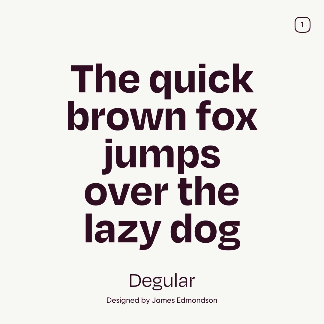
01. Degular
Degular is a sleek and versatile sans serif typeface that lives at the sweet spot between classic clarity and contemporary cool. Perfect for everything from editorial layouts to branding and UI work. It comes in multiple optical sizes and weights, giving designers plenty of flexibility for fine-tuning typographic tone and hierarchy.
This font was designed by James Edmondson, a type designer based in Oakland, California, and published through his foundry OH no Type Co.
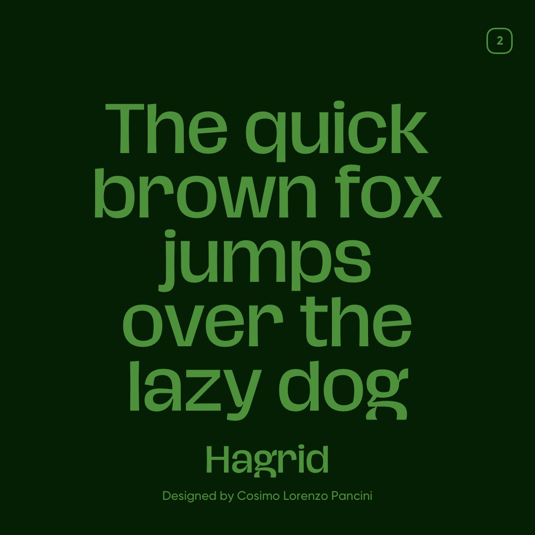
02. Hagrid
Hagrid is a wildly expressive sans-serif typeface that blends grotesque structure with calligraphic counterspaces, inverted contrast, and bold, brutalist shapes—giving it a powerful visual voice that stands out in both print and digital layouts. It’s great for editorial projects, branding with personality, or any design that wants a bit of typographic swagger.
This distinctive font was designed by Cosimo Lorenzo Pancini for the Italian foundry Zetafonts, and it’s been refined over time to balance its edgy character with improved readability and functionality.
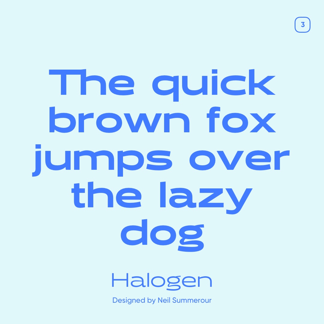
03. Halogen
Halogen is a bold and futuristic sans serif typeface you’ll spot on Adobe Fonts that feels like it was pulled straight out of a sci-fi poster or a sleek tech brand identity. It plays with geometric shapes and tight spacing to give your headlines and logos a confident, modern look that really grabs attention. This font was designed by Neil Summerour, a prolific type designer known for creating sharp, expressive fonts and releasing them through the foundry Positype. Halogen comes in a range of weights and styles on Adobe Fonts, so you can mix and match to build something that feels clean yet full of personality.
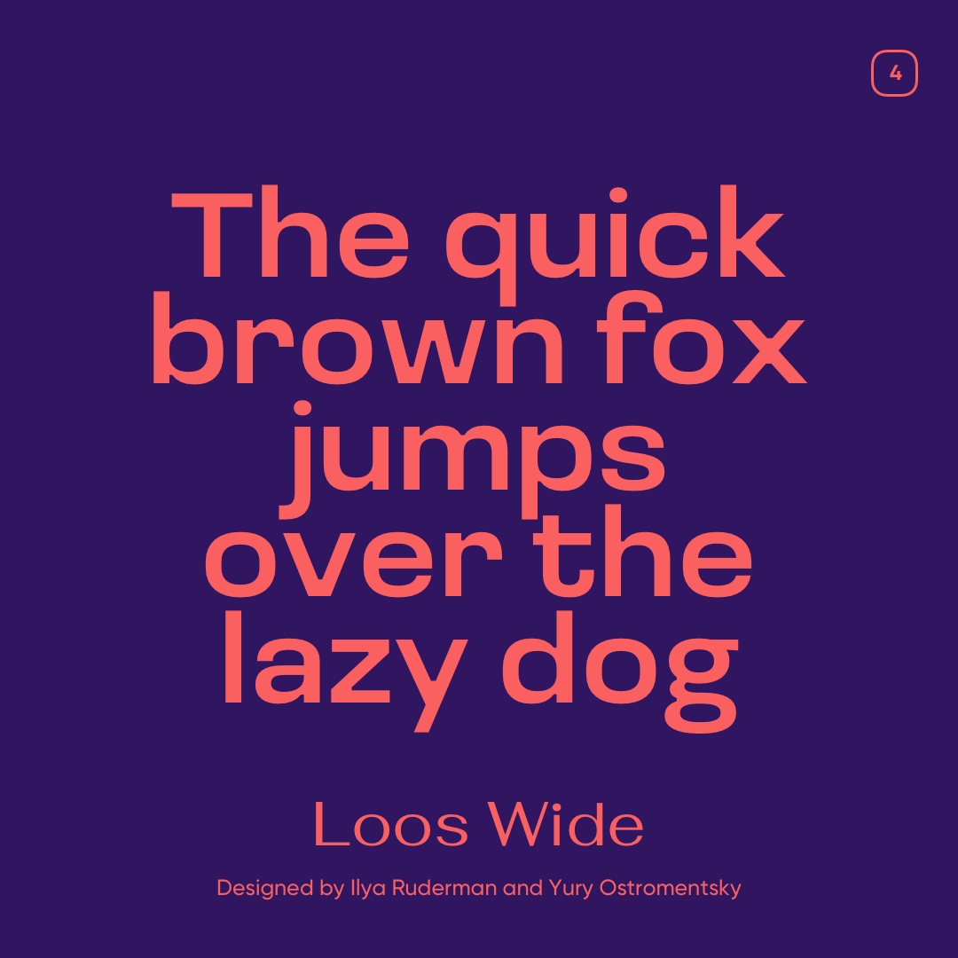
04. Loos Wide
Loos Wide is a bold and expanded version of the Loos sans serif type family on Adobe Fonts that brings a wide, open presence to your design work. It feels modern yet grounded, making it great for headlines, posters, editorial layouts, and projects where you want your typography to speak loudly without shouting. The design leans into generous proportions and clean shapes so your copy stays easy to read even at larger sizes. Loos Wide was created by type designers Ilya Ruderman and Yury Ostromentsky of CSTM Fonts, based on the broader Loos concept inspired by early twentieth-century modernist lettering and adapted for today’s digital workflows.
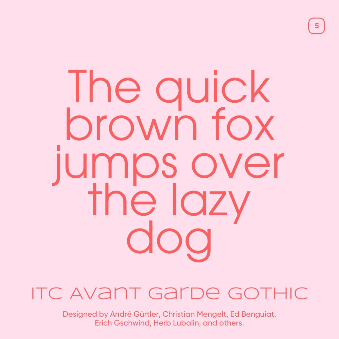
05. ITC Avant Garde Gothic
ITC Avant Garde Gothic is a striking geometric sans serif font on Adobe Fonts that feels like a piece of design history you can use right now. Its clean circles and strong shapes give your headlines a bold, modernist vibe that still feels fresh decades after it first appeared. The typeface grew out of a magazine logo before becoming a full family that designers love for posters, branding and editorial layouts. It was originally created by Herb Lubalin and Tom Carnase for the International Typeface Corporation in the early 1970s and has since become one of the most iconic examples of geometric sans serif design.
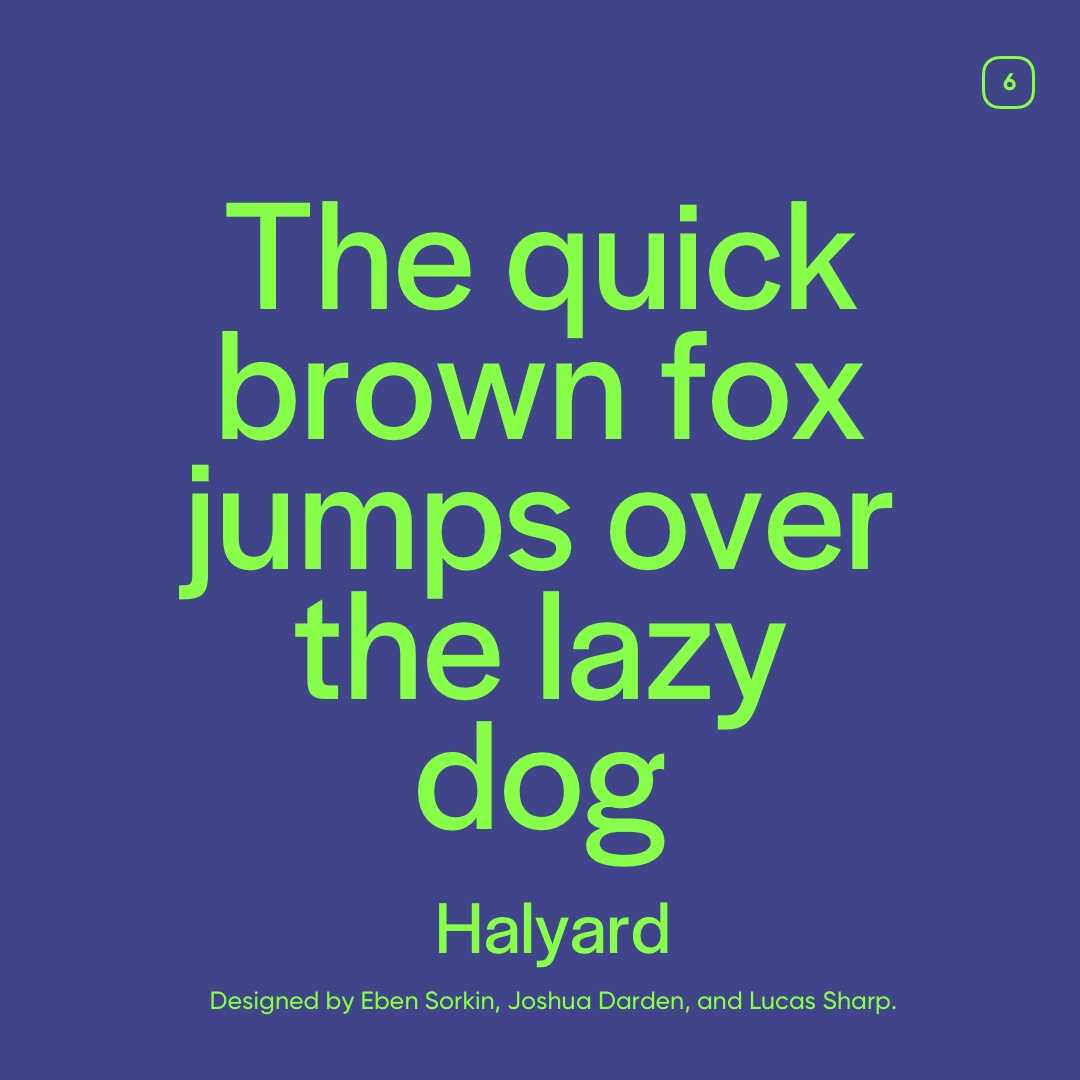
06. Halyard
Halyard is a versatile sans serif typeface with a quietly confident personality that feels at once familiar and refreshingly modern. It was built to perform across sizes with different optical subfamilies optimized for headlines, body text, and tiny captions, all working together in harmony while still keeping their own character. The design brings a thoughtful rhythm and robust shapes to whatever you set, giving your layouts both clarity and a bit of quiet flair. Halyard was created by a team of type designers including Joshua Darden, Eben Sorkin, and Lucas Sharp of Darden Studio, where the focus is on typographic excellence that feels both contemporary and rooted in tradition.
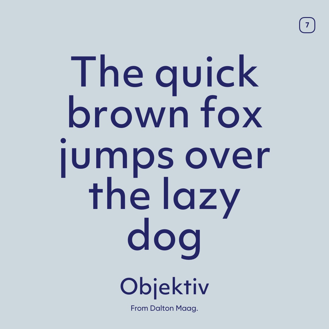
07. Objektiv
Objektiv is a geometric sans serif that feels crisp, modern, and meticulously crafted. Its shapes are rooted in simple geometry yet refined with subtle human details, giving it both precision and warmth on the page. This makes Objektiv a go‑to choice for everything from clean editorial text to sharp branding and signage. The typeface was designed by Christian Schwartz, with later expansions and refinements by Akiem Helmling and Marc Wölfer, creating a family that balances technical clarity with visual harmony.
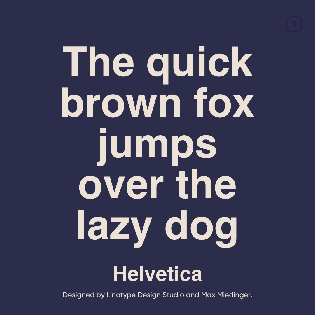
08. Helvetica
Helvetica is the ultimate classic sans serif: clean, neutral, and endlessly versatile. Its simple, well‑proportioned shapes make it a favorite for everything from corporate branding to signage and editorial layouts. Helvetica was originally designed by Max Miedinger with input from Eduard Hoffmann in 1957, and it quickly became a defining example of modernist type design. Its timeless clarity and neutrality keep it relevant and widely used even decades later.
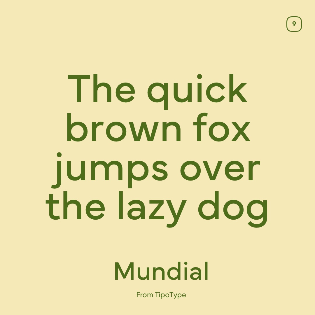
09. Mundial
Mundial is a thoughtfully crafted sans serif typeface whose name literally means “worldwide” and reflects its aim to blend influences from different typographic traditions into one cohesive design. Its letterforms feel balanced and approachable, making it great for a wide range of use cases from branding to editorial layouts. Mundial was developed by the TipoType Team, with key contributions from designers like Fernando Díaz, and its design ethos is all about unity, clarity, and global typographic harmony, bringing together gestures from many eras and cultures into a seamless whole.
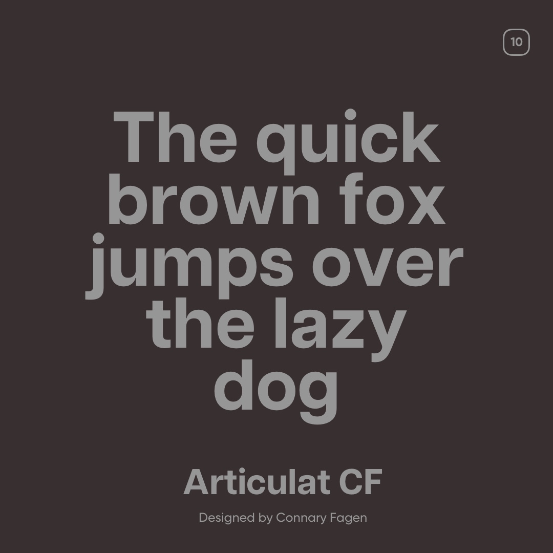
10. Articulat CF
Articulat CF is a sharp and confident sans serif that channels clean mid‑century modernism into a versatile contemporary typeface. Its geometric yet warm letterforms make it great for branding, editorial layouts, and user interfaces that need clarity without feeling cold or boring. The design was created by Connary Fagen, whose independent foundry work focuses on strong typography that reads beautifully across weights and sizes. Articulat CF stands out for being both bold and readable with a modernist spirit that still feels fresh and purposeful.
If you want to see the fonts in action and get more details on them, then click here.
💡 Want to add Adobe Fonts to your own Bravemark projects? Watch this quick tutorial below.
Johan Steneros
CEO and Co-founder of Bravemark, an online brand guidelines platform for brand identity designers.
Create awesome brand guidelines
Bravemark makes it super easy for designers to create responsive online brand guidelines that are not only stylish but also functional.
